Wednesday, November 12, 2008

Yo Frito!

Fritos Label
Adobe Illustrator

Here's my newest project. I had to replicate the Fritos label using the Adobe Illustrator on the computer. I was pretty proud of how quickly I accomplished this one. Its only about 5"x5" but the logo turned out pretty sharp. Not much else to tell you about this one, just standard digital drawing work. Let me know what you think!
I'll have my own font/typeface coming soon along with a book poster to promote Alien Allen. Keep checking back!

Monday, October 27, 2008

Alien Abduction!


Children's Book Covers
Considering my "Pollilop" book company, these are my book covers for "Alien Allen". I had to have three final options for this week with slight differences in each and one completly different. I decided to use the whole children's book and run with the idea of including textures, foil, cloth, and wire. The other two are similar with differences in font and illustration. This was a three week long project that I'm so glad its done. It was a stressful process coming up with three ideas that satisfied both me and my teacher. I have to pitch my ideas to my class today so wish me luck!
(sorry its such bad photo quality)

Wednesday, October 22, 2008

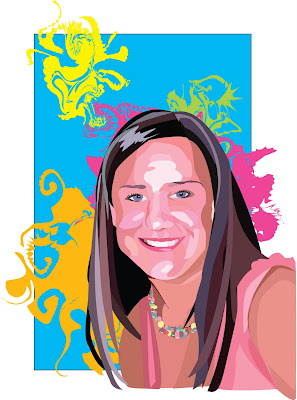
Splattered Sarah


Self-Portrait
Adobe Illustrator

This took a lot longer than what it looks like. I think i've finally finished it with all the shadows and highlights. I was allowed to add my own background, so i splashed a few bright colors in. I actually really like this one and i like how it turned out.
Let me know what you think :)

(If you don't know what Illustrator is- Basically, i looked at a picture of myself and drew shapes of shadows and highlights with the pen tool on my computer. Then chose the right colors to appear like my face. I had about 10 different layers of skin tones and hair colors. )

Wednesday, October 15, 2008

We Will Rock You!


Lancaster Music Festival Logo
(Digital Drawing)
I had one heck of a time rendering this type but I finally fixed it with help from a friend. Adobe Illustrator and the pen tool drive me nuts, hence the simplicity of this design. Its definitely not one of my favorites since it was giving me such a hard time.


Queen Band Logo
(Typography)
Helvetica and Big Caslon are the two fonts I mashed together to create this logo. This is all drawn by hand and I still don't know if the sharpie fumes have effected me yet. I was told to keep it simple and try to reflect the band's style in the logo. I hope this represents Queen well, considering they're classy and bold all in one.
As Always, I love feedback. Let me know what everyones thinking.
(I have a critique in the morning!)

Friday, October 3, 2008

Leobra/Zepard

Giftwrap.
Horrible picture, i know. This is for my digital drawing class which is basically adobe illustrator. We had to design our own giftwrap and replicate it in illustrator. Not too interesting but it looks good considering this was my first time using illustrator and i think i did pretty well. 

Wednesday, October 1, 2008

Lollipop. POP!

Children's Book Company Logo.
All hand drawn, I came up with this silly idea of a lollipop for my logo. For some reason Pollilop kept popping in my head every time i said lollipop. I believe someone used to say that when they were younger. But here I am using it as a company name. My teacher seemed to like the idea and so I ran with it. This is one of the three final pieces for that logo, this of course being my favorite. 
Gimme feedback people :)

ps. if we ever start writing children's books, we'll be set mom!

Tuesday, September 23, 2008

Me, Myself, and I


Self-Portrait collage

My latest Graphic Tech project. This one was a lot of fun because I had a lot more freedom to use my own ideas and create my own piece. Hopefully everyone like it as much as I do.

Sunday, September 14, 2008

When i grow up, i wanna be famous.

I wanna be a star, i wanna be in movies.

Finally getting into my graphic design projects. This is my first for Graphic technology. Not much just an easy movie poster starring yours truly. I thought it was cool and fun considering i've learned a lot in the past few days. I'll be posting all my projects as I go so keeping checking in. 

Saturday, July 26, 2008

Sneaking out late..


A few more photos from our photo shoot way back when.
I finally got this film on a cd so I have a hard copy of the images.
I have about 180 photos if anyone would like to see more let me know :)

Saturday, June 7, 2008

Cherub
Acyril on Matboard

Finally a new piece. I know its been a while. 
I was really interested in the renaissance style of my last painting so I decided to do a whole piece in this style. This is obviously a copy of the famous cherub painting by Raffaello. I only painted the one angel but I really like this style. I think I might experiment more with these types of paintings in the future. 
Let me know what you think. :)

Thursday, May 29, 2008

Here We Go, Steelers.

Calling all Pittsburgh fans.
This is a first semester piece in conte. 
I'm just super excited for the upcoming season and thought I should share my joy with everyone else.
The bottom rectangle was orignally a bus for "the Bus" but my prof didn't agree.
I think the bus would've made it more Steelersish. I miss Bettis.

Palamaloo. (Its Polamalu.)

And for extra excitement. I'M MOVING! Getting out of the ghetto.
My two new roommates are amazing and i'm sure we'll share the same creative tension that lingers in my lonely apartment. Anyone is welcome to visit :)

Tuesday, April 22, 2008

School's Out for Summer.

The final outcome is not so great. It all just looks funny to me. Not very appealing.
( this piece actually took a long time and considering i was running on a lack of sleep i'll admit it isn't my best. )
But... I'm Done! 

Monday, April 21, 2008

Drawing Suite


I have finally finished my drawing suite that I've been working on all semester. I've had two critiques on some of these pieces already and my final critique is tomorrow (all day!). I basically chose to draw different vases and work on perfecting their shape and shading without a background. It has been a long journey with these drawings and I'm still not completely satisfied with all of them. I'm anxious to see what my class will think because I haven't had the best responses so far. Most are just with dry media, simply placed in the center of the paper. The 2nd and 3rd pieces were added for "mystery" as silhouettes. (Suggested by my teacher, who knows why). 
I also wanted to let you all know that I had an awesome final critique from my 2D teacher. He said some of my things were perfect (which i don't agree with) and he was very impressed! :)
YAY! All that stressing for nothing.  One more day left of class! I can't wait.
Check back soon. I'll have my 2D projects posted when he gives them back.

Wednesday, April 16, 2008

Familiar faces and dandelion bracelets


I grew up where I could see the stars
Drinking sweet tea from a Mason Jar
Dogwood trees like leaves through the pine
People on the porch watch fireflies.

The last pieces for my portraiture film series. 
These girls look amazing and they helped out so much.
Let me know you thoughts :)


Monday, April 14, 2008

Come on Eileen.

Acrylic on chipboard
Obviously its not finished yet, but this is the beginning of my 2D design project. Not much to look at so far; slowly but surely i will accomplish my final piece. There is going to be three different sections in the final piece. This painting is referenced from a classic renaissance piece. The first section is to be completed realistically from the source. The middle section will be a continuation of the same renaissance painting in a more decorative aisian style. The final section will also be the same painting created with a certain mood or feeling in mind. Hopefully the end result will be better than just this portion because i worked very hard to finish this much. Like my Lucielle Ball painting, this chipboard is about 4 feet tall. Oh boy do i love finals week!
Let me know what you all think so far. Comments/suggestions welcomed!!

Wednesday, April 9, 2008

Dress Up!


Cool Cuz's Club
These are the beginning of my final portrait project for my photo class.
The beautiful models are my cousins and we all had lots of fun playing dress up like the old days. Although we're growing up, we'll never be too old to have this kind of fun. 
I need 8 prints, I took about 180 pictures of them, for this project so expect more soon.

Wednesday, April 2, 2008

35mm Film

These are some of the photos I've been working on for the past few weeks for my class. I've spent a lot of money and hardwork on these even though they aren't perfect. I'm really starting to enjoy this class. My final project is portraiture, so keep your eye out for a new post with those pictures.
Reflection
Homemade Mailbox
Railroad Crossing
Rusted
Effects of a Storm
City Island Bridge
Amish Farm
Downtown
The Capitol
Florist

Monday, March 31, 2008

Finger Painting

Lucy, you got some 'splaining to to!
Acrylic on chipboard
I have finally completed the beloved Lucielle Ball painting. It didn't turn out as great as I had expected but I think I'm finally satisfied after the long hours it took to finish. She doesn't quite look like I love Lucy but that fiery red hair helps. This was a project for my 2D color design class called optical mixing. Your eye is supposed to visually combine all the different colors to create an image. We had to chose pictures with high contrast, but were not allowed to use black paint to create the shadows. So the darkest shadows had to be the pure color from the tube and we mixed in white to show highlights. It was a long process considering this painting is about four feet tall and I was finger painting. 

Saturday, March 29, 2008

Personal Artworks

Miss Audrey Hepburn
Acrylic on canvas
This was actually a spur of the moment painting for one of my greatest friends. She loves Audrey and it was a a gift that she deserved. I believe the photo was taken before a few minor adjustments were made but I was pretty pleased with the final piece. Also, if you are familiar with this famous photograph of Audrey Hepburn, you'll realize it is backwards. I take most of the pictures with the camera on my computer, so most paintings are opposite of what is shown. 


Guitar Test
Watercolor, charcoal, and acrylic
I have been practicing with several different mediums lately. These three pieces were created from one sketch, but completed in three different mediums. I had questioned many people about which one they appreciated most. Although there was no clear winner, I liked these three as one composition. I'm waiting to get them framed as one piece in 3 seperate windows in the same order as in the photo. 


Pappy
Watercolor 
My grandfather adored this house and was heartbroken when he had to leave. 
Although he believed no one liked him, I painted this a couple years ago for him to reminisce. His dream career was architecture so I tried my best to completely represent this house without leaving out any detail. I had my difficulties because watercolor is not the easiest medium, but this piece actually won an honorable mention at the Brockway Art Show.

Friday, March 28, 2008

I flow better when my colors show.

I've created this blog as a way for others to check out my latest creations.
My first year at art school has been quite a challenge but I'm proud of my accomplishments.
I will post new pictures as I finish projects and hope to get some comments on each.